EARTHSHARE.ORG
Nonprofit Website Redesign
Project: Full website rebuild using EarthShare's new branding.
Stakeholders: EarthShare's CEO, COO, CMO, Marketing Manager, and Graphic Designer.
Role: UX Lead, Researcher & Designer
Overview
EarthShare's COO came to me for help in rebuilding their website to solve the following challenges:
Site needed a visual refresh with new branding
Site traffic and conversion were low
Users (anecdotally) were struggling to understand the content and who EarthShare was
The current website didn't have a place for the new Individual Membership product being released
Wanted to launch a new Individual Membership product
Discovery
My initial goal is to collect as much existing data and information about the company, project and scope of work:
Requested a Creative Brief
Scheduled calls with all project stakeholders
Collected current site website analytics
Acquired Branding Guidelines
Reviewed Persona documentation
Studied the marketing KPIs for the projected site
Asked for any existing market analysis
Reviewed competitor research
It was clear that more research was needed. We had only anecdotal information about a negative user experience on the site, specific to messaging and navigation. I wanted to validate this and also understand this feedback better.

After performing a heuristic review of the original website, a few things popped out:
Site navigation was confusing and redundant
CTAs were not clear about their destination
Website copy was lengthy and verbose
Pages were long with lengthy scrolling
Bounce rates on the home page were high
Very few visitors were making it onto the Programs & Services page
Research
Once I had a handle on what data existed and what data was needed, I started writing a research and design plan to present to the team. This included:
Persona Visual Chart
The existing persona profiles contained information gaps, so I pulled all of the information into a visual chart to better understand where it was missing. I then clustered the information we did have to identify any similarities among our personified user groups.
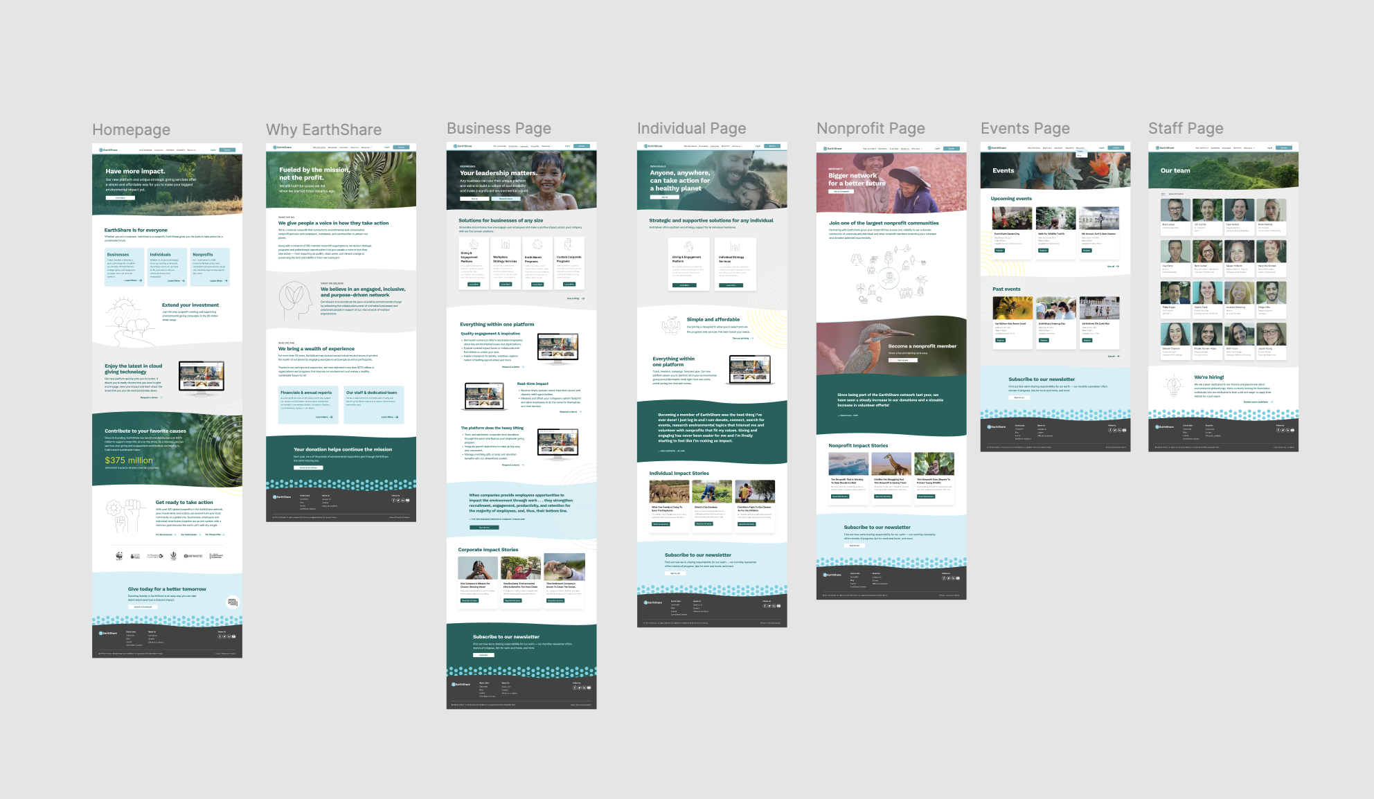
New Sitemap
It was clear that the site needed a new internal architecture, so after reviewing the existing sitemap and content, I created a new sitemap to streamline the user experience, create new groupings for the content to live in, and loosely start to plug in marketing funnel features like CTAs.
Vision Board / Design Brainstorming
(not shown) created a living Google deck with screenshots and notes of competitor sites and other sites that displayed desirable characteristics that I was looking to put into the new site. Shared with stakeholders and collaborated with them with their contributions to the deck as well as comments.
WordPress Theme Review
As Earthshare's website is a WordPress platform site, I worked with the Graphic Designer on staff to find appropriate new design themes and features to frame the new website.
Initial Prototypes
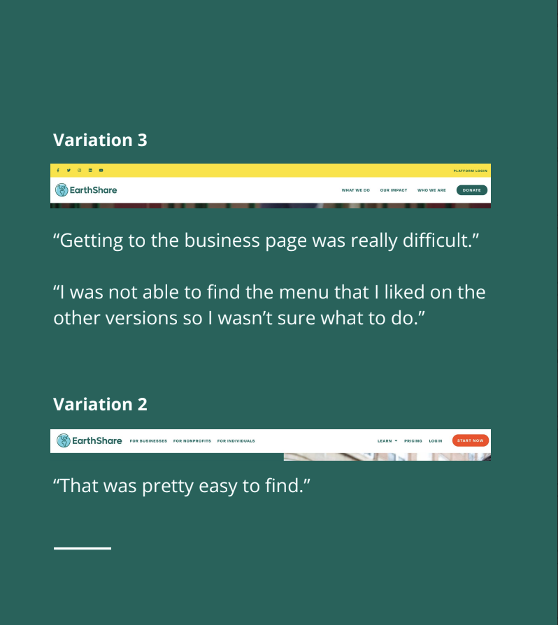
Worked with the Graphic Designer on staff to develop three different prototypes of a potential new website using the proposed sitemap and visual ideas. He created the three variations of the website to use in my testing plan.
Usability Testing
I conducted qualitative usability testing through userbrain.com with users who met specific screener questions to gather data on their initial impressions and interactions while they reviewed and compared the three prototypes.
Findings
Once the usability tests had concluded, I documented and analyzed the findings with a Rainbow Chart because it's a very effective and efficient way to identify trends across many users.
I always like to summarize my findings clearly to present them to stakeholders, so I chose to put them in a Summary Presentation, which I then shared with all stakeholders on the project.
Navigation is most clear to users when they do not have dropdown options to choose from in the navigation bar and when it calls out each audience type directly.
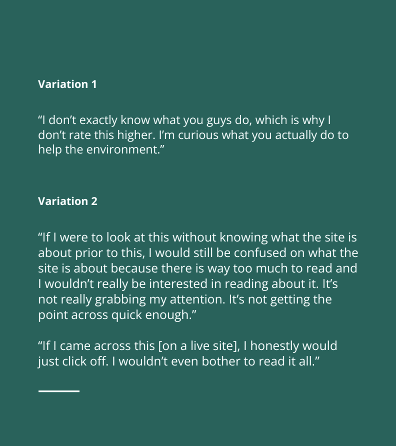
The content/copy was not clear and too long.
Testers typically were able to reiterate the verbiage they saw on the website and understood that EarthShare provided products and services to either just businesses or to businesses, nonprofits, and individuals in a general way. However, they could not provide a detailed response about what EarthShare was, how it worked, whether or not it was a nonprofit, or what its differentiators were, nor the details of what it offered. It often became assumed that EarthShare more broadly aimed to help people give back to the environment [ in some way ].
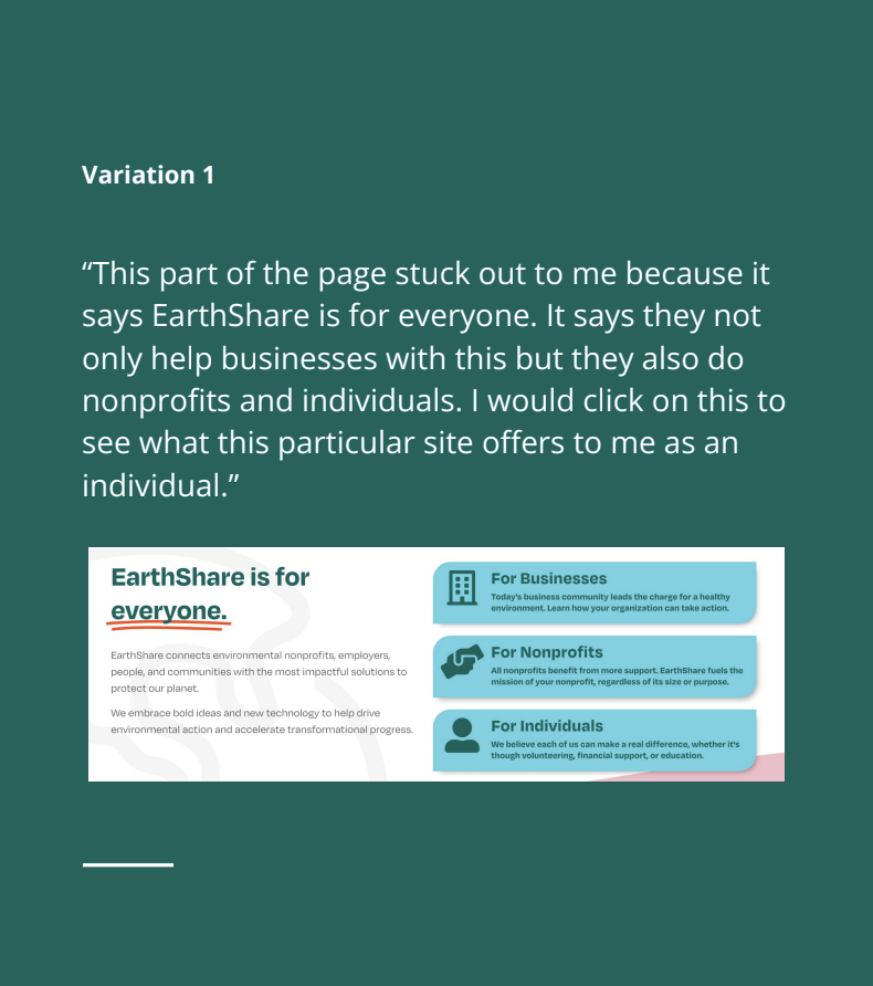
Having the three audiences called out visually on the home page helped make it clear to users that EarthShare catered to all three groups (not just businesses).
Individuals were especially attracted to this and found it inspiring.
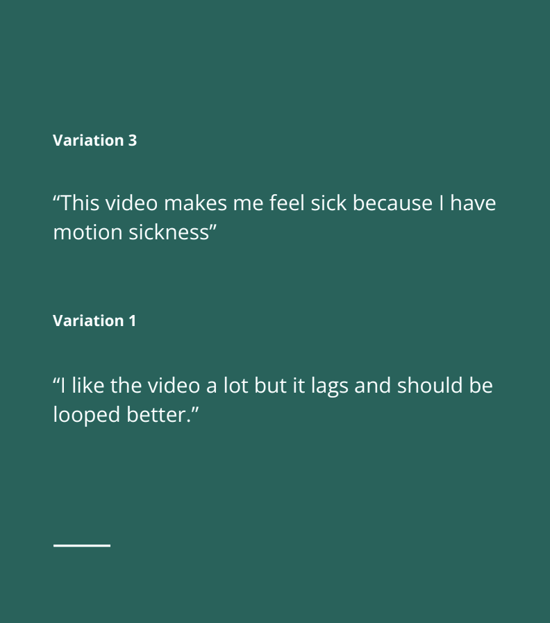
Users found the video in the hero sections engaging, with exceptions.
Two users pointed out that the videos made them nauseous, especially the video on V3 that runs multiple clips in various loops. For ADA compliance and general usability, there must be an option to pause and stop the video immediately in view.
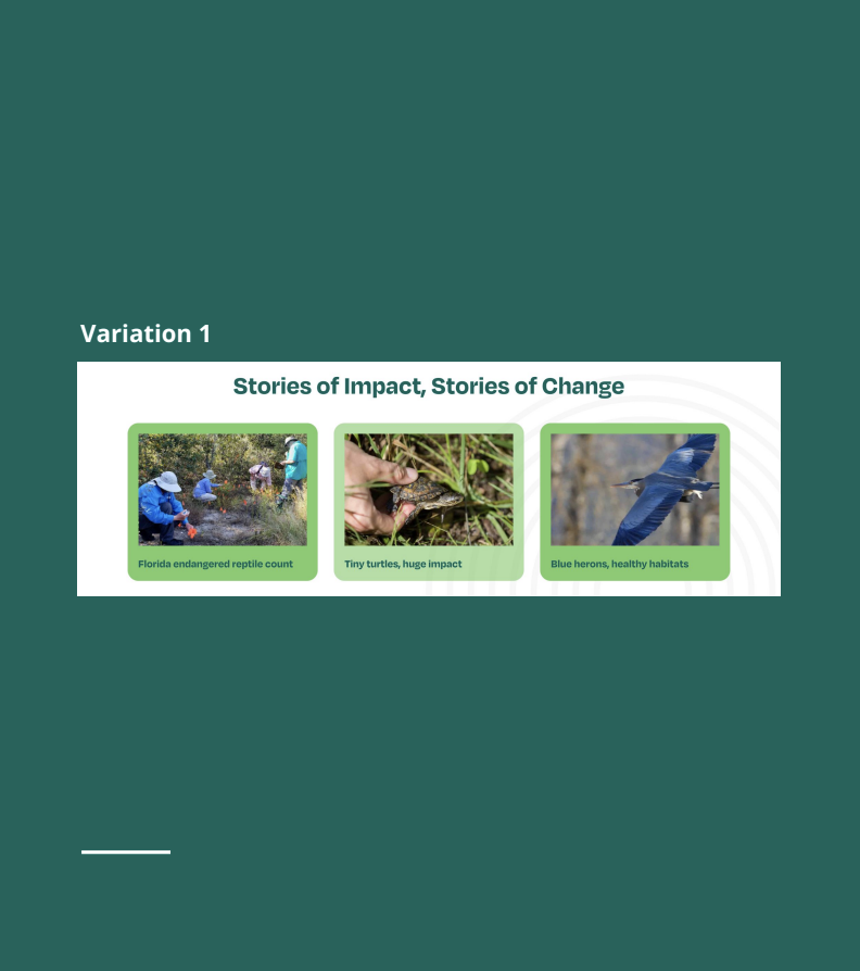
Users liked the “Impact sections”.
This seemed to have an emotional draw with individual users and pulled them into wanting to stay on the site and learn more. They felt they were clear that there was a way for them to take action.
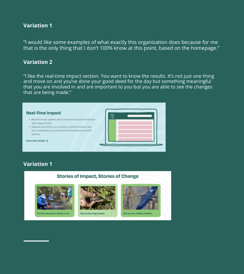
Human and animal-centric imagery elicited a more emotional response than the iconography alone.
The turtle photo struck an emotional chord with two users. The other photos were appreciated. Although none were pointed out as being key to the page, users noted that they liked seeing them.
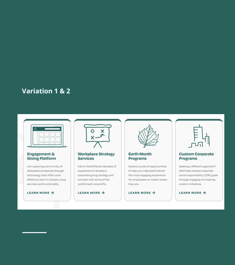
The business solutions product/services tile was the main place from which users sourced EarthShare’s product and service offerings.
Users repeatedly referenced this section for the question asking about which products and services EarthShare offered. They found it easy to read and called out the interest in learning more with the “learn more” CTAs..
Additional Takeaways
A few users felt that pricing was missing from the page and wouldn’t be interested in taking the next step unless they could see that; even if it was just a range of prices.
Users like the text in V3 which calls out ability to donate or invest directly, which was not mentioned directly on V1 or V2. It made them feel that they could take action directly (and more quickly), if interested.
Some users wanted exact examples (case studies) about the details of how Earthshare works with a business/individual or has had an impact on the environment.
Users like the new font, especially the hierarchy of the bolder, larger headings and the smaller subtext.
Copy should be speaking directly to the user about them, versus talking about EarthShare. This helps user connect to the messaging and feel a part of the conversation.
Design
The findings from my research always fuel our design. The UI Designer and I sat down and extracted tangible takeaways from the findings to establish a core design strategy, which she then took and prototyped.
Through multiple design reviews together, we cleaned up the design and brought it to a completed first final in mid-fidelity form.
Handoff
Attendees: COO, CEO, Graphic Designer, Marketing Manager
As this was a freelance project, I coordinated one final stakeholder meeting to review and discuss the mocks and hand off the designs and project to the Earthshare.org team.
Conclusion
As this was a freelance project for me ( I am not a full-time employee at Earthshare.org) , at the end of the UX Playbook I encouraged the team to follow the conversion metrics closely with the website analytics and to continue performing usability testing on the site to continue its enhancement. I also encouraged them to follow the original KPI's set out at the beginning of the project to ensure the new site is meeting those metrics of success.
This project was a very fun project to work on with some challenging problems to solve. There was not a lot of up front data to work with, they had mostly anecdotal evidence of the previous site's poor performance and they were a small team with limited capacity but all very motivated and super bright.
The team came together and in the end everyone was very proud of the collaborate work and the final result!