
BURTON.COM
My Account Portal Redesign
Project: Full My Account Portal Research and Redesign
Stakeholders: Senior Leadership, Development, Regional Teams, Global Creative, UX
Role: UX Lead, researcher, designer
Overview
The My Account pages were one of the oldest areas of the site and lived on the legacy code base. Features and capabilities in the old experience were lagging compared to competitor sites. Data from customer service and our analytics tools showed consumers having both navigational and technical challenges with the old design. Bringing the pages onto a new code base presented an opportunity for a complete redesign of the pages and an ability to lead discovery and research into some of the existing issues and potential solutions.
Discovery
I first led our team in collecting data from various primary sources, such as website analytics tools, CRMs, and NPS surveys with specific My Account Preferences (MAP) questions. I also collected third-party data by conducting a Competitor Analysis of other e-commerce MAP experiences and gathering information from the Baymard Institute and other market research institutions. This combined data helped me identify gaps in our knowledge, which helped us form key goals for our usability studies.
Our two gaps in knowledge:
1. How do users navigate finding information in the My Account menu?
2. How do users expect their order history and order detail information to be displayed?
Research methods proposed:
1. Tree Test - To understand how users navigate the My Account menu.
2. Card Sort - Understanding user expectations for displaying order information.

Primary Data
Customer chat requests on account-related topics:
27,507 total chats
48% : Product Q’s
24% : Order information
12% : Order tracking
8% : Order status
Site Analytics | April 16th - May 16th, 2023
My Account Main Dash:
80s : Average time spent on page
21% : Highest click-rate Chat link
65% : clicks on Chat icon
30s : Time to first click on Chat link
34s : Average time spent on page
4% : Second highest click-rate (Contact Us)
.08% : Clicks on Chat icon
18s : Time to click (Contact us)
Order History Main Dash:
25% : Highest click-rate Chat link
17s/18s: Time to first click on First/Second Order #
2.47: Click recurrence on “track order” text blurb
28% : Highest click rate on Chat link
1.37: Click recurrence on“track order” text blurb
The data showed us very clearly that users were looking for order-related information and tracking information in the current My Account experience, and were heavily seeking support from customer service, especially around product and order related questions.
Research
STUDY #1 | Navigation Tree Test
QUESTION
How do users navigate nested terms to find the information they expect to see within their account sections?
METHODOLOGY
A/B test. 15-minute unmoderated sessions via userlytics.com
PARTICIPANTS
50 participants, aged 18-60
USA, UK, CA
English speaking
UX METRICS
Time on task
Task success
First click analysis
Sentiment analysis for the nav (positive, negative, neutral)
Survey question: Reasons for setting up an e-commerce account
Screenshot of Userlytics analytics panel
STUDY #2 | Orders Card Sort
QUESTION
How do we better understand the expectations that consumers have around finding information on their orders, tracking, and returns?
METHODOLOGY
15-minute unmoderated sessions via userlytics.com
PARTICIPANTS
16 participants, aged 18-60
USA, UK, CA
English speaking
UX METRICS
% of users who placed list items into each category
Affinity-mapped responses to open-form questions
Measure % of recurring sentiments
Screenshot of Userlytics analytics panel
Findings
It all begins with an idea. Maybe you want to launch a business. Maybe you want to turn a hobby into something more. Or maybe you have a creative project to share with the world. Whatever it is, the way you tell your story online can make all the difference.
% of Testers who created accounts with e-commerce sites primarily to track and manage orders.
Tree A
Tree B
% of testers who create accounts with e-commerce sites because it makes shopping easier.
Tree A
TreeB
In general, testers spent less time navigating the menu when menu items were more nested, as opposed to openly laid out and visible.
68%
of testers
Would expect to see an image of the purchased item both on Order History and on Order Details pages.
Said customer service, when inaccessible, provides a negative brand experience.
19%
of testers
of testers
44%
Would expect to see an FAQ in both Order Details and Order Summary sections.
of testers
75%
Said communication and feedback around order status provides a negative experience when lacking.
of testers
13%
Would expect to see loyalty points received for each order.
The findings from my research always fuel our design. The UI Designer and I sat down and extracted tangible takeaways from the findings to establish a core design strategy, which she then took and prototyped.
Through multiple design reviews together, we cleaned up the design and brought it to a completed first final in mid-fidelity form.
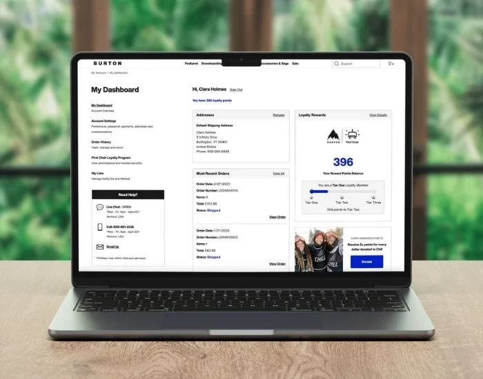
Initial Design
Stakeholder Review
Attendees: Manager of Merchandising, Director of Digital eComm, Merchandising Lead, Global Creative Team, UX Team, Customer Service
Next, we took the final prototype to multiple stakeholder review sessions, where I presented the prototypes along with the project scope and data. We collected stakeholder feedback, which we took into a second design iteration.
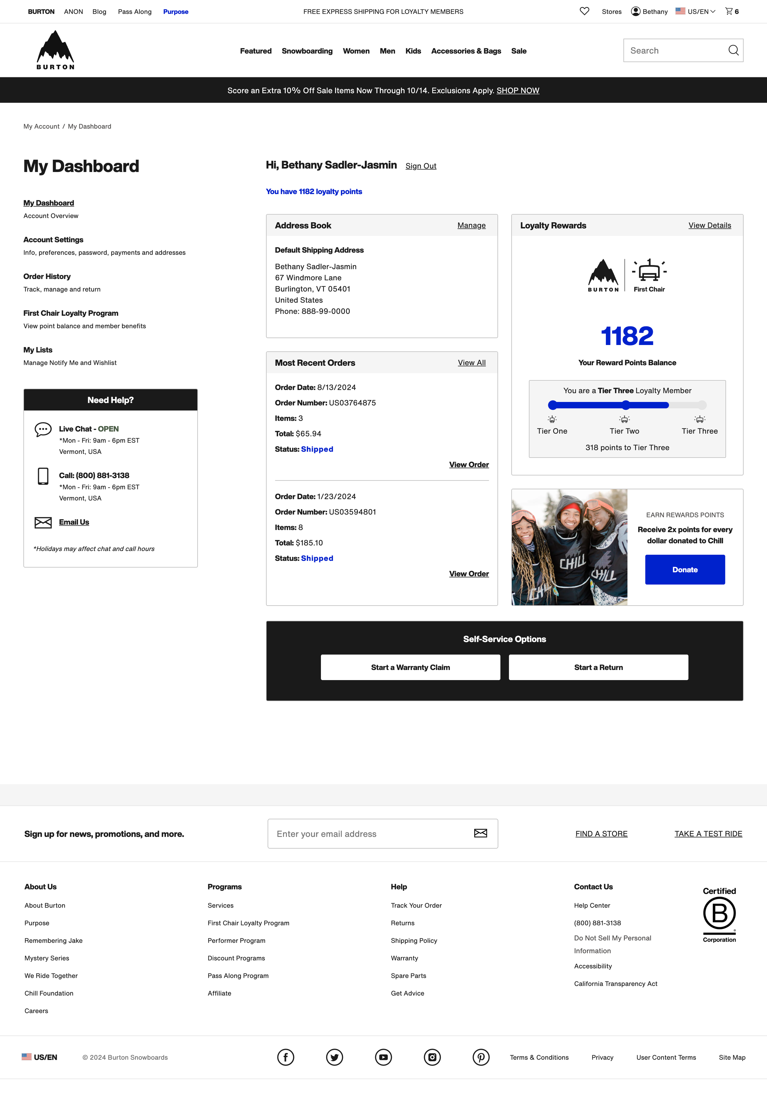
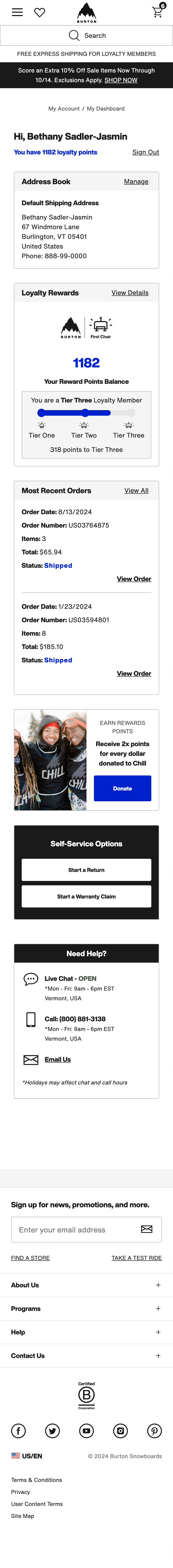
Final Design
Finally, we brought the final high-fidelity mock to life which included final stakeholder feedback, dev feedback and any adjustments leading into official Dev handoff for the project.
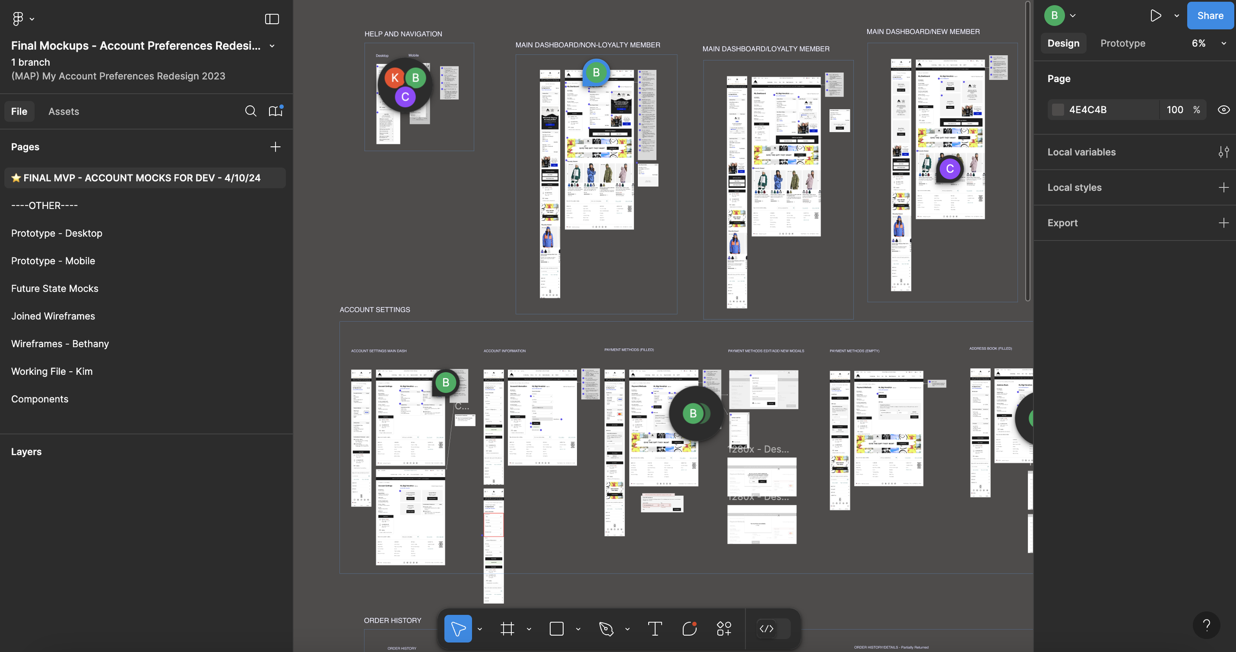
Dev Handoff
Attendees: 13 Engineers, Director of Digital eComm, 2 Project Managers, UX Team
We then took our completed high-fidelity mocks, added annotations, flows and any additional notes. We cleaned up layers and the Figma file to make it ready to bring into our Dev Handoff.
Measurement & KPIs
Achieve a reduction of 30% in calls to customer service about My Account-related usability issues
Monitor frustration clicks
Benchmark YOY engagement and activity rates from old and new pages in Q4 2024
Improve order history page load times
Increase account membership to 500K members by EOY24