
BURTON.COM
E-Commerce Listing Page Redesign
Project: Full PLP/Product Listing Page Research and Redesign
Stakeholders: Senior Leadership, Development, Merchandising, Global Design, UX
Role: UX Lead, UX Researcher, and UX Designer
Overview
Request to redesign and transfer the current product listing page over to a new dev platform. Provided an opportunity to redesign/rethink existing components, architecture, and key features.
Discovery
Research statements:
We want to understand better how users interact with and experience eCommerce category/listing pages for outdoor soft/hard goods products to improve our new category page experience, minimize friction points, and increase conversion.
Research goals:
Discover how users feel about their overall experience across five different types of category pages.
Collect insights about users’ pain points, frustrations, and barriers while navigating information on the eCommerce category.
Evaluate how users are currently interacting with filters, color selectors, quick view, and product pictures on eCommerce category pages
Understand what information users expect to see on category pages before adding an item to a cart.
Research
Third Party Research
I started the process out with discovery work to identify:
Trends in PLP design across other high-performing websites
UX Standards for PLP design established by Baymard, Nielson Norman Group, and other 3rd party UX researchers.
Read the Burton business requirements for the PLP project
Filled in any missing information with stakeholder conversations.
Content Square: user session pathways
Primary Quantitative Research
Next, I used Content Square to collect quantitative data on our current PLP pages.
Identified established user flows from PLP to other pages.
Collected data on page bounce rate, scroll rate, and conversion rate.
Performed Target Analysis on the page to identify click rates, frustration clicks, and attraction rates.
Watched recorded sessions of users with high frustration points on the page.
Website Traffic and Activity Data
Qualitative Usability Testing
Lastly, I let any missing data points or questions lead to my qualitative usability tests. I performed two rounds of testing.
COMPARATIVE ANALYSIS
12 users on desktop and mobile, US & Canada
Comparison usability test across 4 live PLP sites: Burton, Patagonia, The North Face, Arc’Teryx
Collected sentiment analysis, general behavior observation, Likert scale ratings, and task completion data.
FIRST ROUND PROTO USABILITY TEST
12 users on desktop and mobile, US & Canada
Comparison usability test for 3 new Burton PLP prototype variations.
Collected sentiment analysis, general behavior observation, Likert scale ratings, and task completion data.
Usability Testing Study 1
Usability Testing Study 2
Website Competitive Analysis
Lastly, I reviewed competitor e-commerce websites to see what other companies in the same industry were providing for an experience on their listing pages so that I could identify any common usability functions or standard practices that a user may expect to find on our website.
Screenshots were organized and captured using FigJam.
Findings
Once the usability tests had concluded, I documented and analyzed the findings with a Rainbow Chart because it's a very effective and efficient way to identify trends across many users. I also used Mural to capture qualitative insight and observations.
I always like to summarize my findings clearly to present them back to stakeholders, so I put my findings in a summary presentation, which I then shared with all stakeholders on the project.
In general, testers use these top 5 criteria when scouring listing pages: Style, Fit, Color, Size, Reviews
67%
of testers
Found online shopping more convenient than shopping in a brick-and-mortar store.
of testers
66%
Use customer reviews to evaluate product.
66%
of testers
Liked reading some description text under each product listing.
of testers
67%
Find it hard to evaluate fit and feel online.
Sessions and PLP page views are higher on mobile for burton.com, indicating users start their shopping journey here and an increased need is mobile optimization.
+92% higher
Softgoods
+105% higher
Hardgoods
+36% higher
Bags
Alternatively, we found the conversion rate (and activity) was higher on desktop for burton.com, indicating users favored completing purchase on desktop.
+82% higher
Softgoods
+120% higher
Hardgoods
+72% higher
Bags
Not all users engaged with filters, but those who did found them helpful only if the filters matched the terminology they were expecting and allowed them to narrow down the product line accurately.

“I’m going to use the filters until my number of choices is reduced from 181 or something, closer to maybe a dozen. Using the filters to get down to 13 results was brilliant.”
— Usability tester on burton.com
Initial Design
The findings from research always fuel my design. I then took the key takeaways from the Rainbow Chart and Mural board, along with the third-party research I collected, and designed a final proto for each page in Figma.
Stakeholder Review
Attendees: Manager of Merchandising, Director of Digital eComm, Merchandising Lead, Global Creative Team, UX Team, Customer Service
Next, I took the final prototype to 3 stakeholder review sessions, where I presented it along with the project overview and data collected. I also collected feedback on the prototypes from those sessions and enhanced them based on that input.
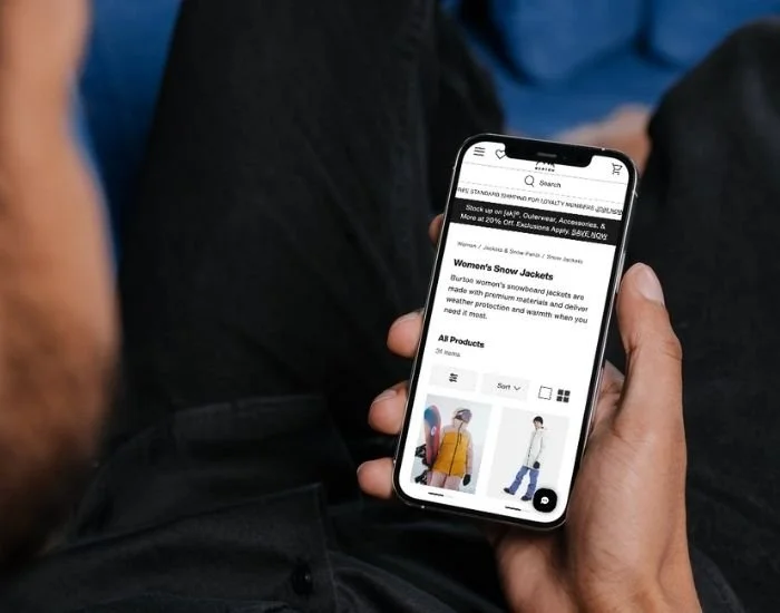
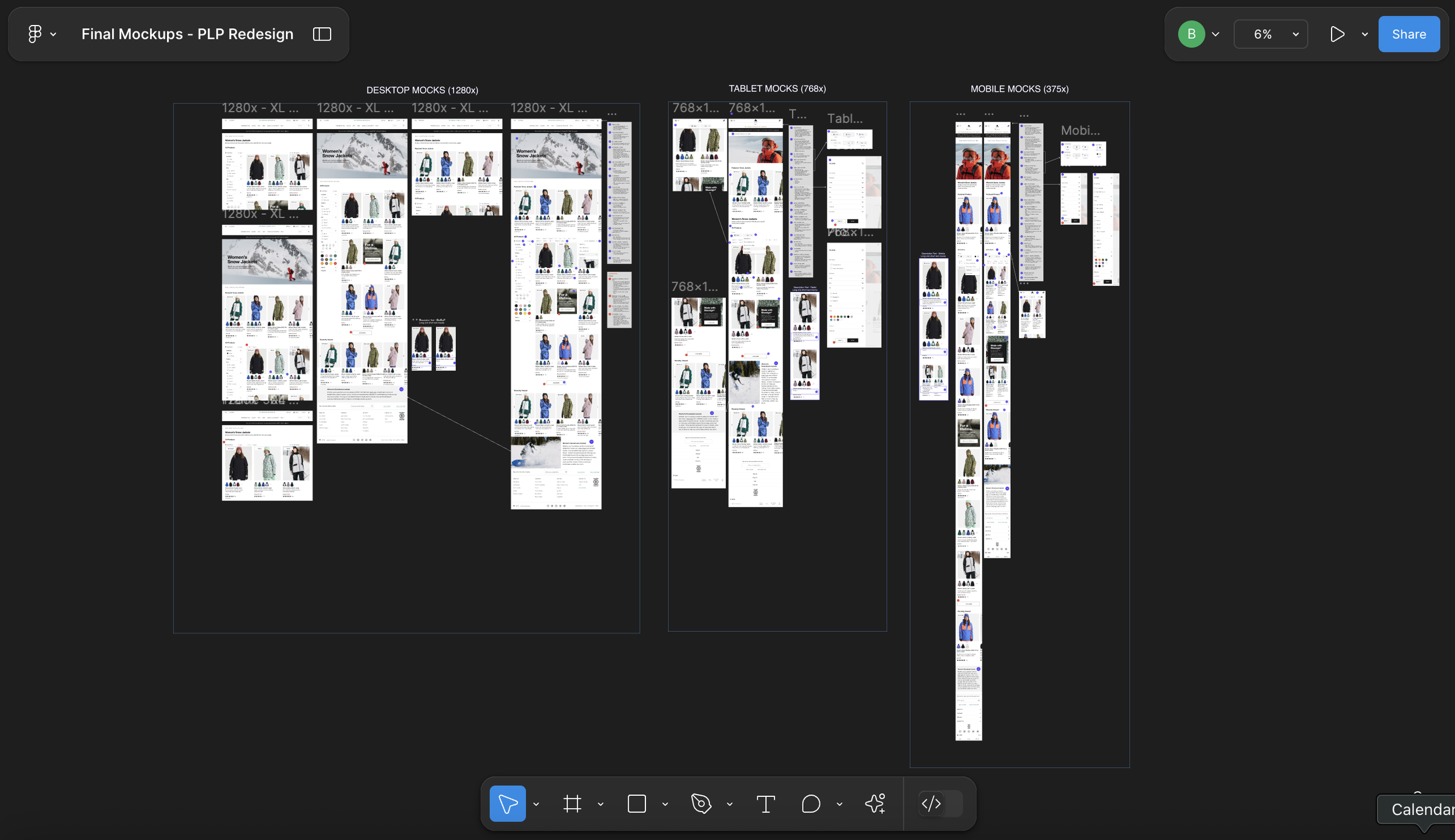
Final Design
Finally, we brought the final high-fidelity mock to life which included final stakeholder feedback, dev feedback and any adjustments leading into official Dev handoff for the project.


Dev Handoff
Attendees: 13 Engineers, Director of Digital eComm, 2 Project Managers, UX Team
The findings from research always fuel my design. I then took the key takeaways from the Rainbow Chart & Mural board, along with the 3rd party research I collected, and designed each page on both mobile and desktop in Figma with full layout, interaction, and annotations.
I then scheduled an official Dev Handoff with the entire Dev team to hand off the designs for development.
Performance
Once the usability tests had concluded, I documented and analyzed the findings with a Rainbow Chart because it's a very effective and efficient way to identify trends across many users. I also used Mural to capture qualitative insight and observations.
I always like to summarize my findings clearly to present them back to stakeholders, so I put my findings in a summary presentation, which I then shared with all stakeholders on the project.
In general, the new listing pages performed better than the old ones in some core areas.
-6.2%
decrease
decrease
Bounce rate (across all devices)
-4.5%
+21%
increase
Conversion rate (across all devices)
-3.7%
decrease
+2.0%
increase
Exit rate (across all devices)
Load time (across all devices)
Page activity (across all devices)
Conclusion
This was my first significant project for Burton, so I worked regularly with the stakeholders and the dev team throughout the project. Thanks to a larger-than-usual time frame and great stakeholder engagement, it was a collaborative and well-researched project.
Once live, I collected the same metrics of bounce rate, load time, user page flow, and conversion rate to track the performance of the new PLP against the old pages. We were encouraged to see the positive performance.
We now continue to monitor these KPIS and perform zoning analysis on filters, products, and funnels to enhance the experience further.